In the world of digital marketing, landing pages are one of your most powerful tools for converting customers.
A thoughtfully constructed and well-designed landing page can mean the difference between a website visitor just checking out your company and becoming a loyal customer.
And that importance cannot be overstated.
In this article, we’ll touch on what landing pages are and how to optimize them before looking at 30 examples of well-crafted landing pages from various brands.
What Is A Landing Page?
A landing page is more than just any old webpage – it’s a page that’s designed to lead visitors to take a specific action.
This could be anything from making a purchase to signing up for a membership, downloading a guide, or getting a quote from your business.
Landing pages seek to provide the right information succinctly and remove any unwanted distractions so that the likelihood of website visitors taking the desired action is increased.
Optimizing Your Landing Page
So, what goes into creating an effective landing page?
If you’re thinking about building a landing page, the good news is that you can use many different tactics to optimize your landing page.
Generally speaking, you want to create a simple, mobile-friendly page that speaks directly to the target you want to reach. But when it comes to the content, here are just a few effective strategies to leverage:
- Strong headline and body copy: Your headline is often the first thing a user sees when they arrive at your landing page. You should make sure it resonates with your target audience, and that any surrounding copy provides the right context, highlights your unique value proposition, and sells through the message.
- Engaging, cohesive visuals: When it comes to landing pages, visuals really matter. They can help further emphasize your value prop, as well as help communicate your brand voice to website visitors. Be strategic about what visuals you use and where. Videos and images should be high quality and engaging, and think about how you can use animated and illustrated assets to show, not tell. Also, be thoughtful about your use of color and how the page’s color palette can elicit the response you want from visitors.
- Compelling call to action (CTA): Every landing page has a CTA, and this is the action you want your visitor to take. Yours should be positioned prominently on the page, and leverage action-oriented language to convince your visitors to make a move.
- Social proof: Building trust can be crucial in converting customers, but sometimes you only have a small window in which to do so. Including trust indicators such as customer or partner logos, customer reviews, and even testimonials can effectively establish trust quickly.
As I said, these are just a few of the many tactics and strategies that go into building an effective landing page. There’s far more where that came from.
And there are also a ton of SEO-specific tricks that go into making sure your page ranks. We cover them in this article: How To Make The Right Landing Page Rank: A Complete SEO Checklist.
30 Examples Of Great Landing Pages In 2023
1. Netflix
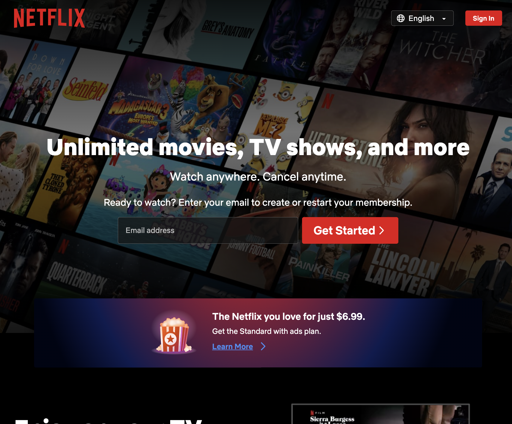 Screenshot from Netflix, August 2023
Let’s start with a remarkable homepage from a household name: Netflix.
The streaming giant’s landing page is short, sweet, and straightforward, including only the necessary details.
It makes it extremely easy for users to complete the goal of the page: entering their email address to get started with a Netflix membership.
Why It Works:
- A single field form above the page fold makes getting started with Netflix seem like a breeze.
- The copy is succinct, states the brand’s value proposition, and makes it clear you can cancel anytime.
- It includes details on basic pricing upfront so users don’t have to go down a rabbit hole to find it.
2. GitHub
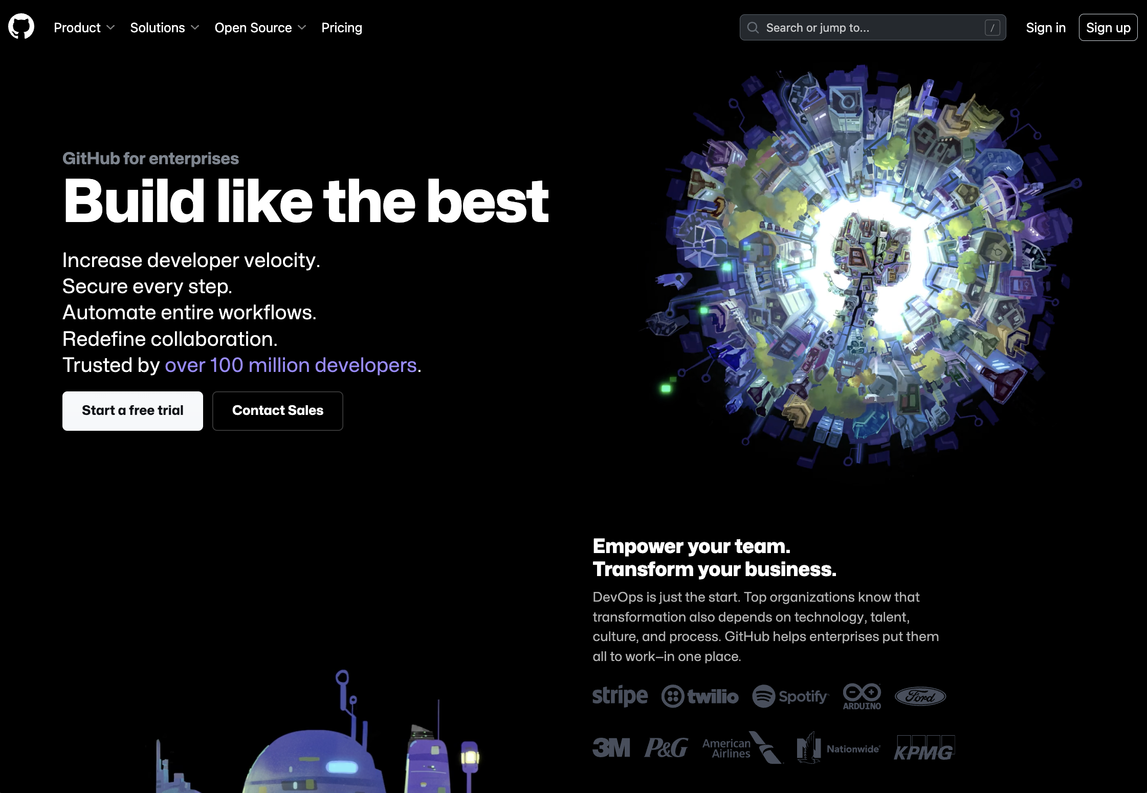 Screenshot from GitHub, August 2023
GitHub is a web-based platform that allows developers to “build, scale, and deliver secure software,” – so it’s no surprise that the company knows a thing or two about building a great website.
Its “GitHub for enterprises” landing page is a great example of a landing page that’s visually stunning but also effective, providing as much information as possible to help the user convert.
Why It Works:
- Stark visuals with a dark background and big, white text that stands out.
- Copy above the fold is brief and designed to highlight the features users will care about most.
- Proof points are included throughout, with customer logos and quotes.
- Two CTAs cater to different types of visitors – those who want to start a free trial and those who want to contact Sales to learn more.
3. Blue Apron
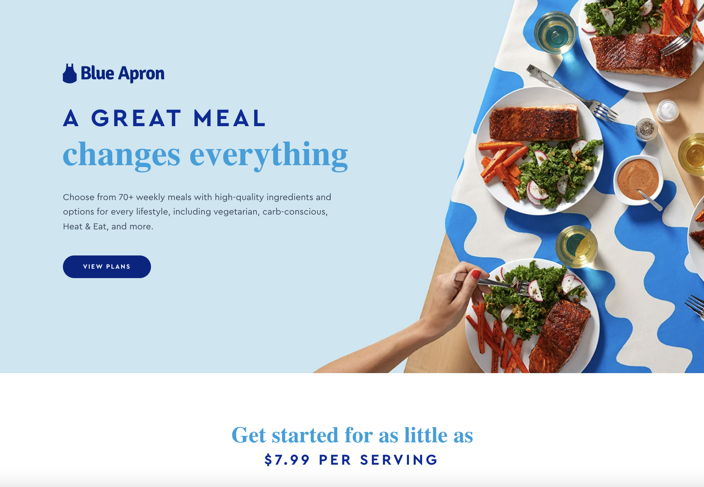 Screenshot from Blue Apron, August 2023
Blue Apron is a home meal planning and delivery company that offers various different subscription plans to its customers.
The goal of this landing page is to encourage visitors to view the plans to find out which best fits their needs – and it does this very effectively.
Why It Works:
- It is visually bright and clean, and uses quality photography to showcase its product.
- Copy effectively communicates the brand’s wide range of meal options and the fact that it caters to many different lifestyle and consumer preferences. It reiterates the core value props of value and convenience.
- The same CTA is repeated throughout the page, giving visitors an incentive to click through.
- Does a good job of highlighting key brand and product attributes without being overly long.
4. Mailchimp
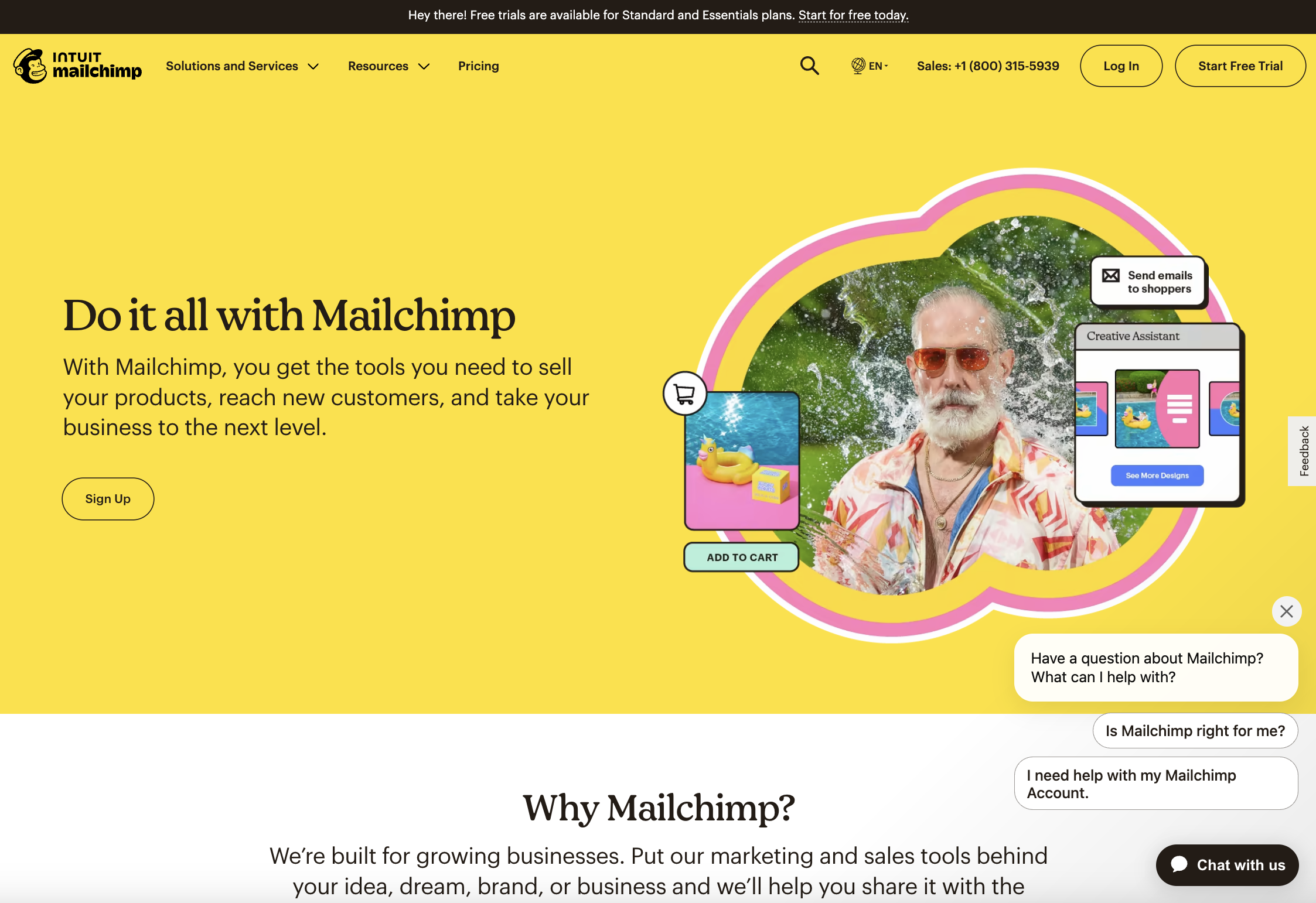 Screenshot from Mailchimp, August 2023
Email and marketing automation platform Mailchimp has developed a reputation for strong B2B marketing – and its “Grow with Mailchimp” landing page is just another example of the company’s savvy.
The page, which is designed to encourage visitors to Sign Up for a Mailchimp account, instantly catches your eye with its bright colors and poppy visuals.
It instantly tells you what you can do with Mailchimp, and then explains how its products can help growing businesses.
Why It Works:
- Simple, clear CTA above the fold.
- Bright colors and fun visuals capture the user’s attention, showcase the product’s capabilities, and create a positive brand association. The use of visuals here really gives a sense of what Mailchimp is like as a brand.
- Strong value prop that makes it clear who the target is for, why you should use it, and how many other brands are already on board.
5. Muzzle
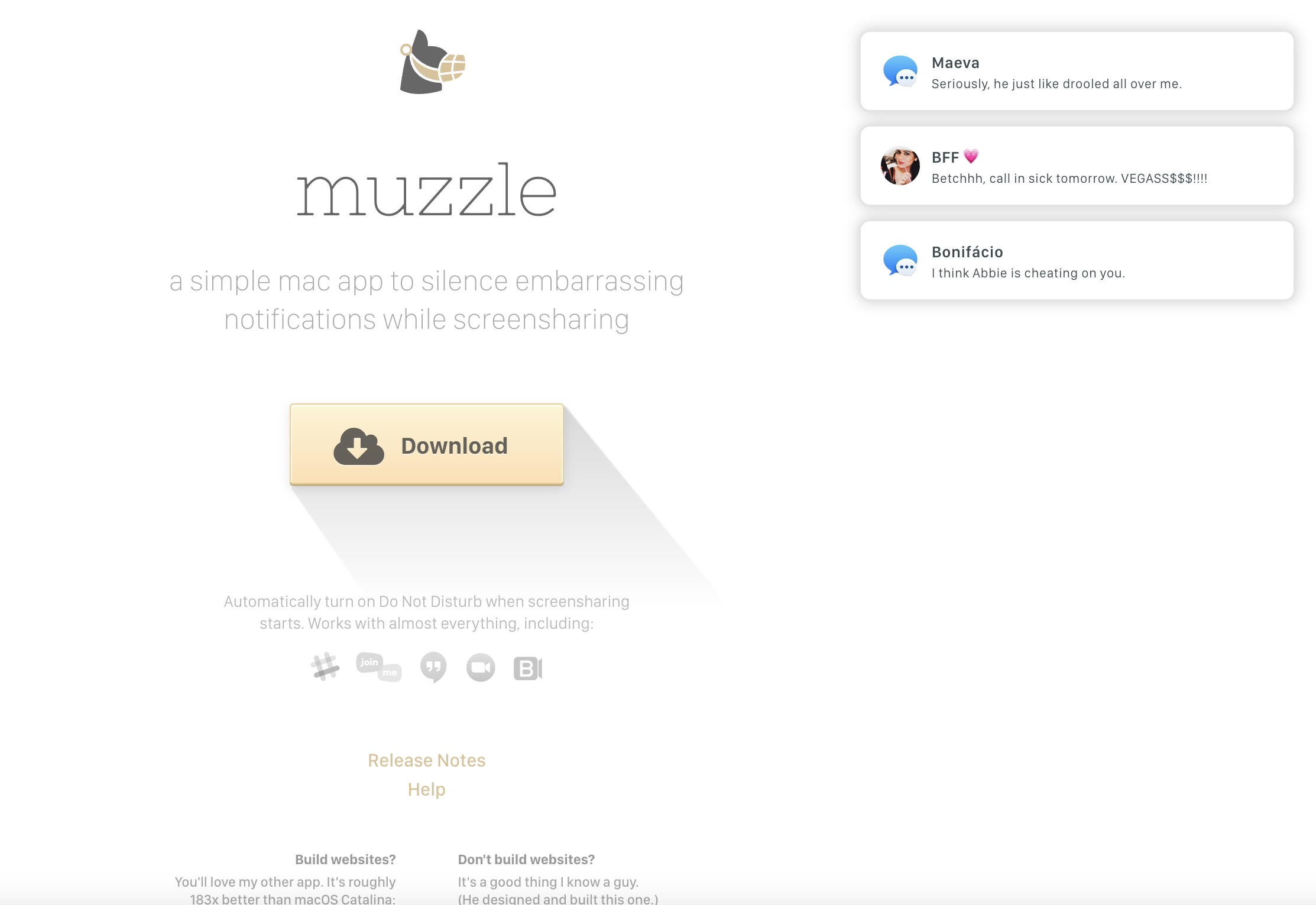 Screenshot from Muzzle, August 2023
Muzzle describes itself as “a simple Mac app to silence embarrassing notifications while screensharing.” And even if you didn’t take that copy in, its landing page does an incredible job of convincing you to download the product.
When you land on muzzleapp.com, you see the brand’s logo, the brief product description, and a big clickable Download CTA.
But your attention is quickly drawn to the animated notifications that start stacking up on your screen, showing embarrassing messages – the kind you would definitely not want popping up in a work call.
Why It Works:
- The page uses humor in a clever and useful way to illustrate the product’s use case.
- From a visual standpoint, the page is understated, with muted greys, which keep it from becoming overwhelming and help draw attention to the animated notifications.
- The CTA button is big, centered, and clear, standing out with a pop of color.
6. Monday.com
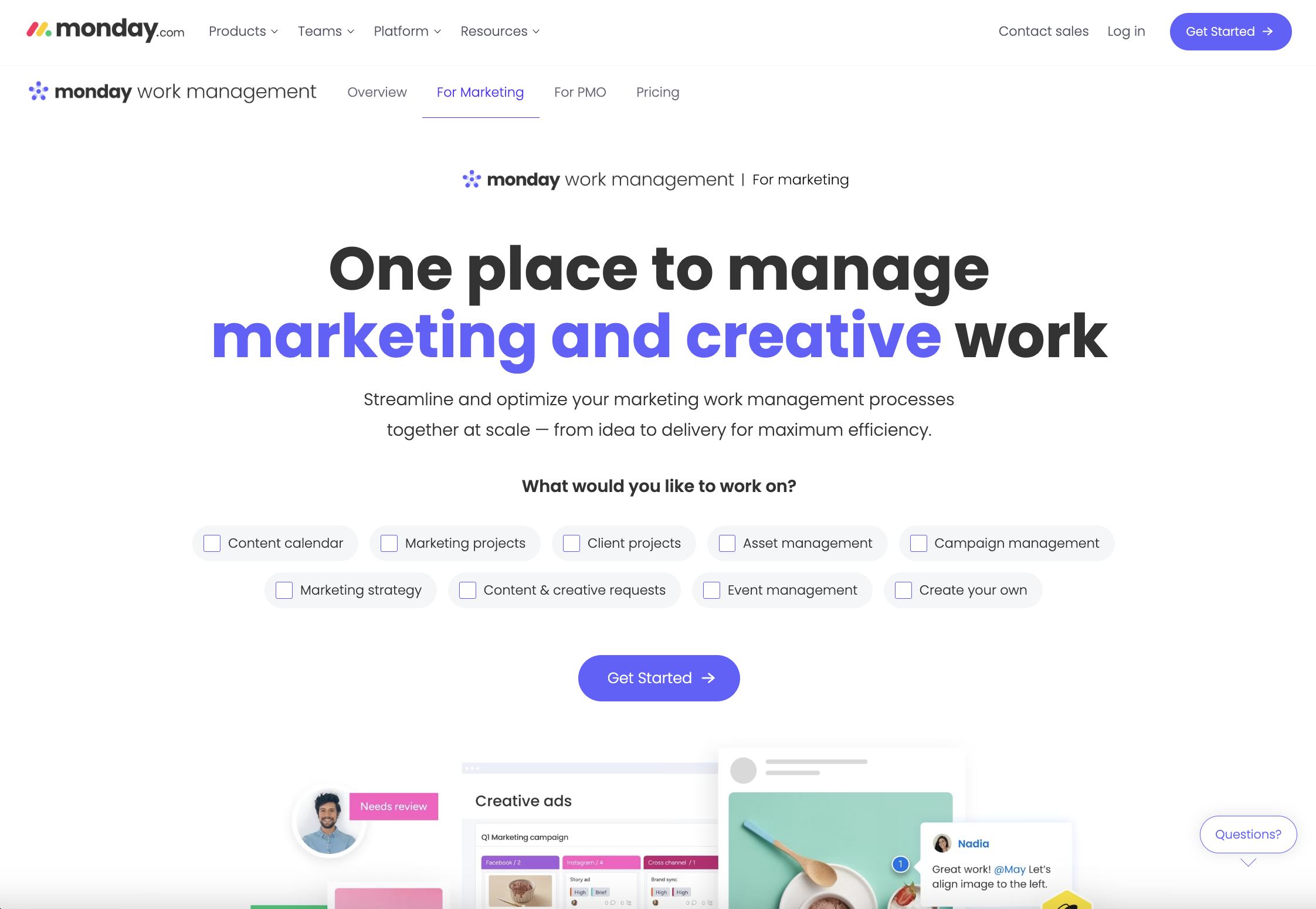 Screenshot from monday.com, August 2023
If you’re a marketer looking to improve your team’s project management capabilities, you might find yourself on the monday work management for marketing landing page.
Designed to highlight how the monday work management product can benefit marketing teams specifically, we like this landing page for a couple of reasons, which we’ll highlight below.
Why It Works:
- It’s interactive. The page doesn’t just speak to the user, but also asks them to select what they would like to work on, providing a number of different boxes that they can check before clicking the “Get started” CTA button.
- It’s minimalist, with clean branding and a white background – so the big, bold, black copy stands out. This page is for marketing and creative teams, so the words “marketing and creative” are delineated in purple, which helps users know they’re in the right place.
- It tells you what the product does and addresses the various specific pain points of its audience.
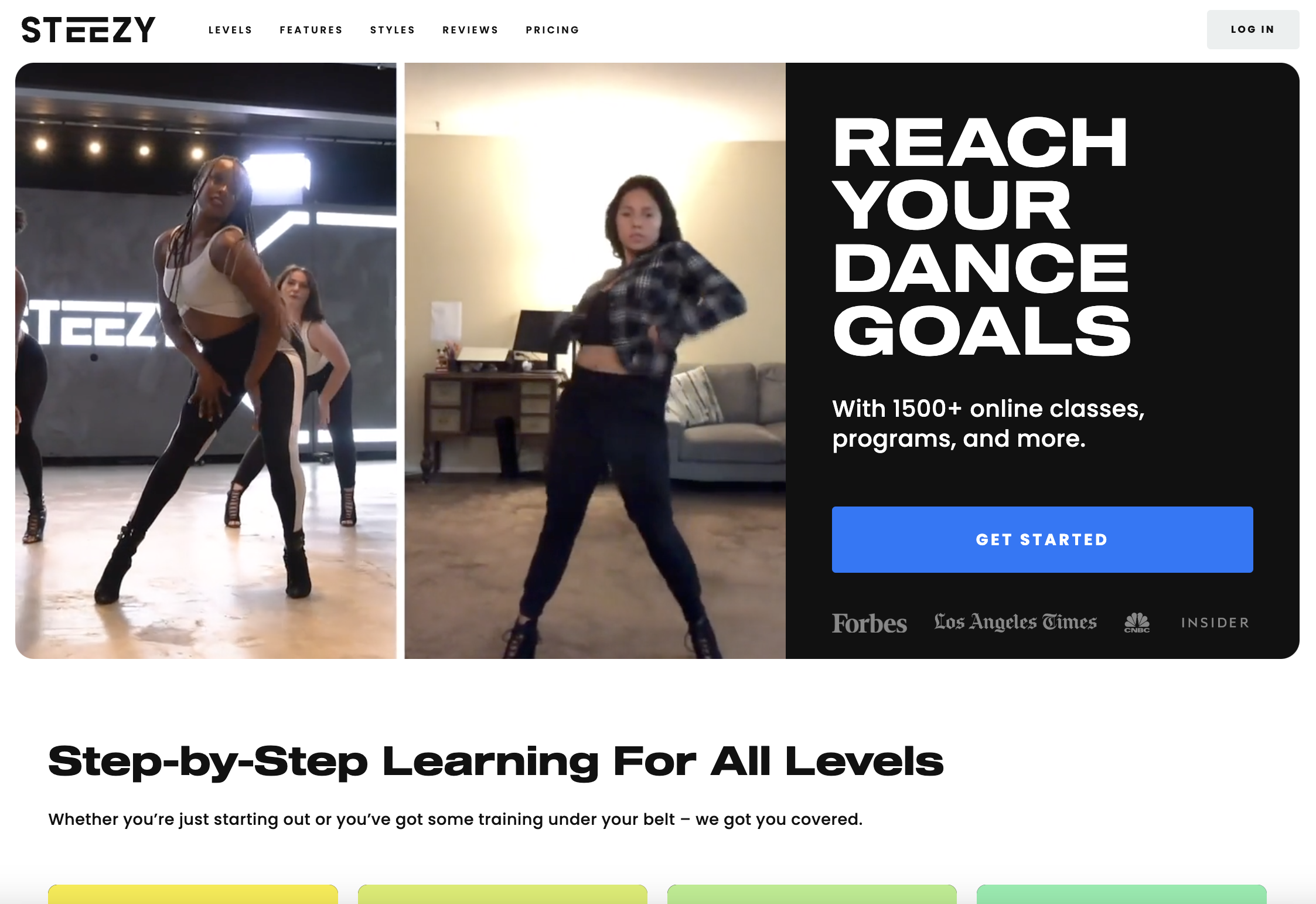
7. STEEZY
Screenshot from STEEZY, August 2023Looking for a new hobby? Why not learn to dance? STEEZY Studio is an online learning platform that allows customers to take dance classes from home. Its classes provide step-by-step instructions for people at all levels so that they can learn the moves at their own pace.
And if you’re not convinced yet, the STEEZY homepage might do it for you.
Why It Works:
- Visitors to the page are immediately met with looping video examples of the product itself: clips from online dance classes. They look fun and exciting, and show side-by-side clips of the classes themselves alongside people dancing along at home, showing users what they could achieve with the product.
- You’re also instantly met with a product promise in big capital letters: “REACH YOUR DANCE GOALS.” And next to the video examples, you start believing that you could do just that!
- CTA is clear, and the copy highlights the fact that STEEZY has over 1500+ online classes and programs to choose from.
- Social proof is also included above the fold with logos from well-known publications where the company has been featured.
8. Dropbox
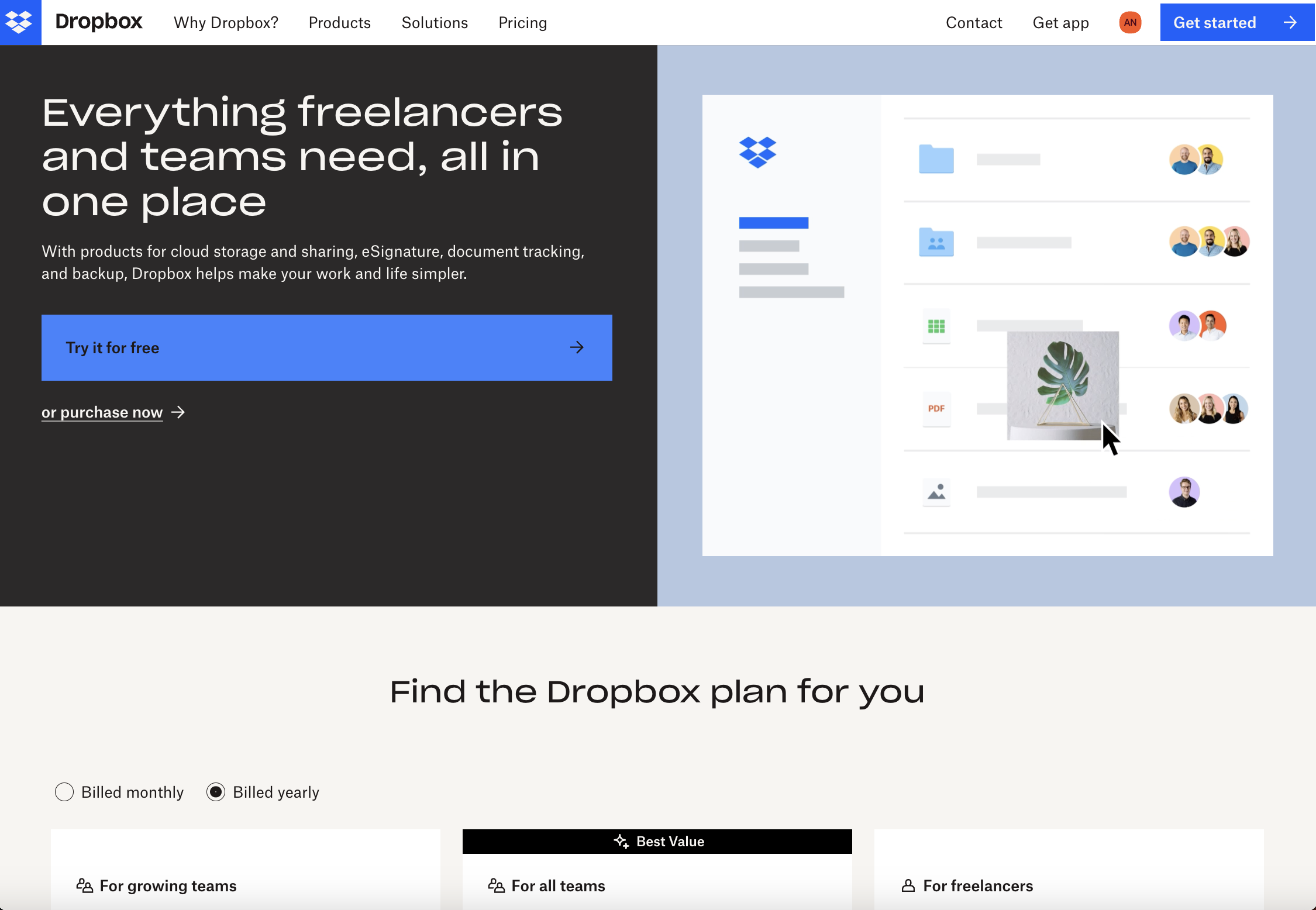 Screenshot from Dropbox, August 2023
There are many different reasons people would need a file hosting service like Dropbox, and this landing page focuses on how it helps freelancers and teams work together online.
That’s clear from the hero copy that drives home how Dropbox gives you everything you need, all in one place.
The sub-copy speaks to the different products and features Dropbox offers and how they’ll “make your work and life simpler.”
Meanwhile, visitors can see a fun animation that shows how the product works in simple terms – and the page even includes detailed pricing information.
Why It Works:
- Fun, animated visuals that showcase the general flow of the product.
- Big, clear CTA that makes it clear users can try the product for free.
- Interactive pricing section that allows visitors to compare different product tiers and find the right option for them.
9. Apple Arcade
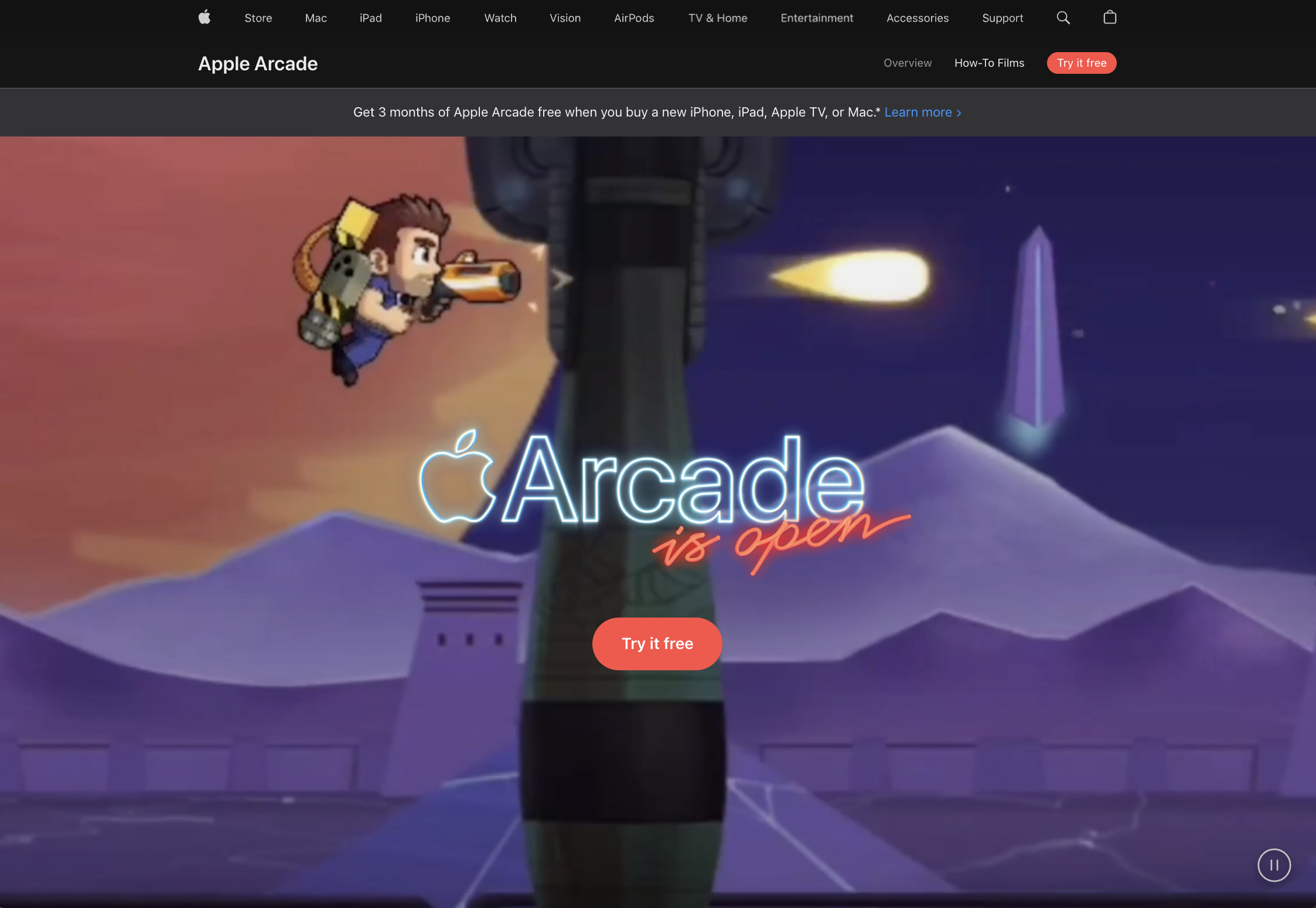 Screenshot from Apple, August 2023
Apple Arcade, Apple’s new video game subscription offering, has arrived – and it has a landing page that we love.
Here are a few reasons why.
Why It Works:
- Almost the entire browser above the fold is focused on showing animated visuals from Apple Arcade’s category of games. The visuals are so big that the visitor feels immersed, and it gives a great preview of what they can expect from the product.
- Copy is sparse for the most part, as Apple is letting visuals show rather than tell. For curious minds, you can scroll down to find the big selling points in bold, red text: unlimited access, no ads, and play online and offline.
- The page includes several options for various deals, including a one-month free trial, or three months free if you buy an Apple device.
10. Oxygen
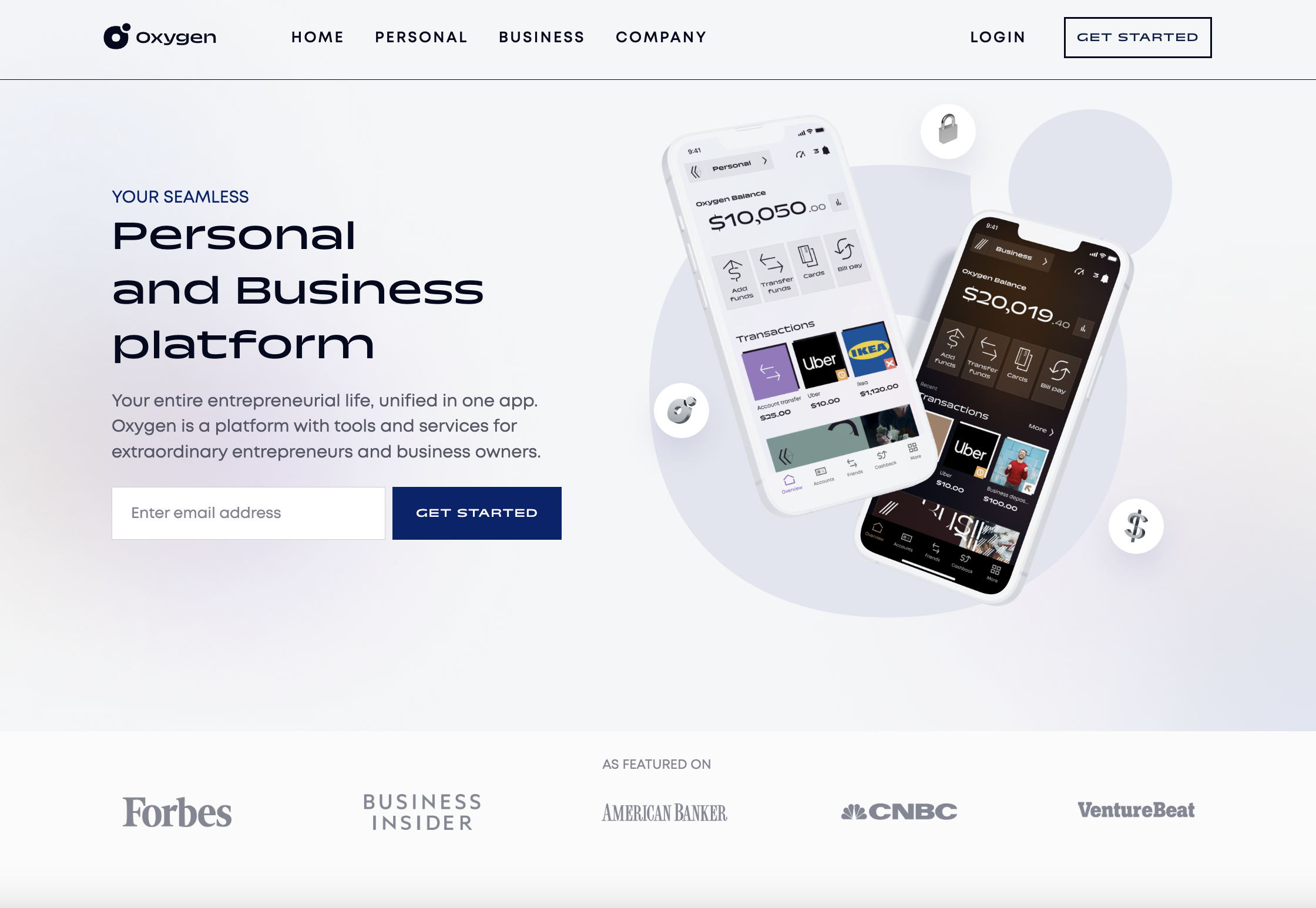 Screenshot from Oxygen, August 2023
Oxygen is a financial services platform with both personal and business banking offerings, targeting entrepreneurs and business owners. This is clear from its landing page, which specifies who the product is for, and showcases screenshots of its sleek app interface.
Why It Works:
- One simple field form to enter your email and get started.
- The copy focuses on who the product serves – that is, it tells visitors who should be interested in it.
- The branding is sleek and minimal, with few distractions. Images and quick animations of the Oxygen product are included throughout the page to generate interest.
11. Wealthsimple
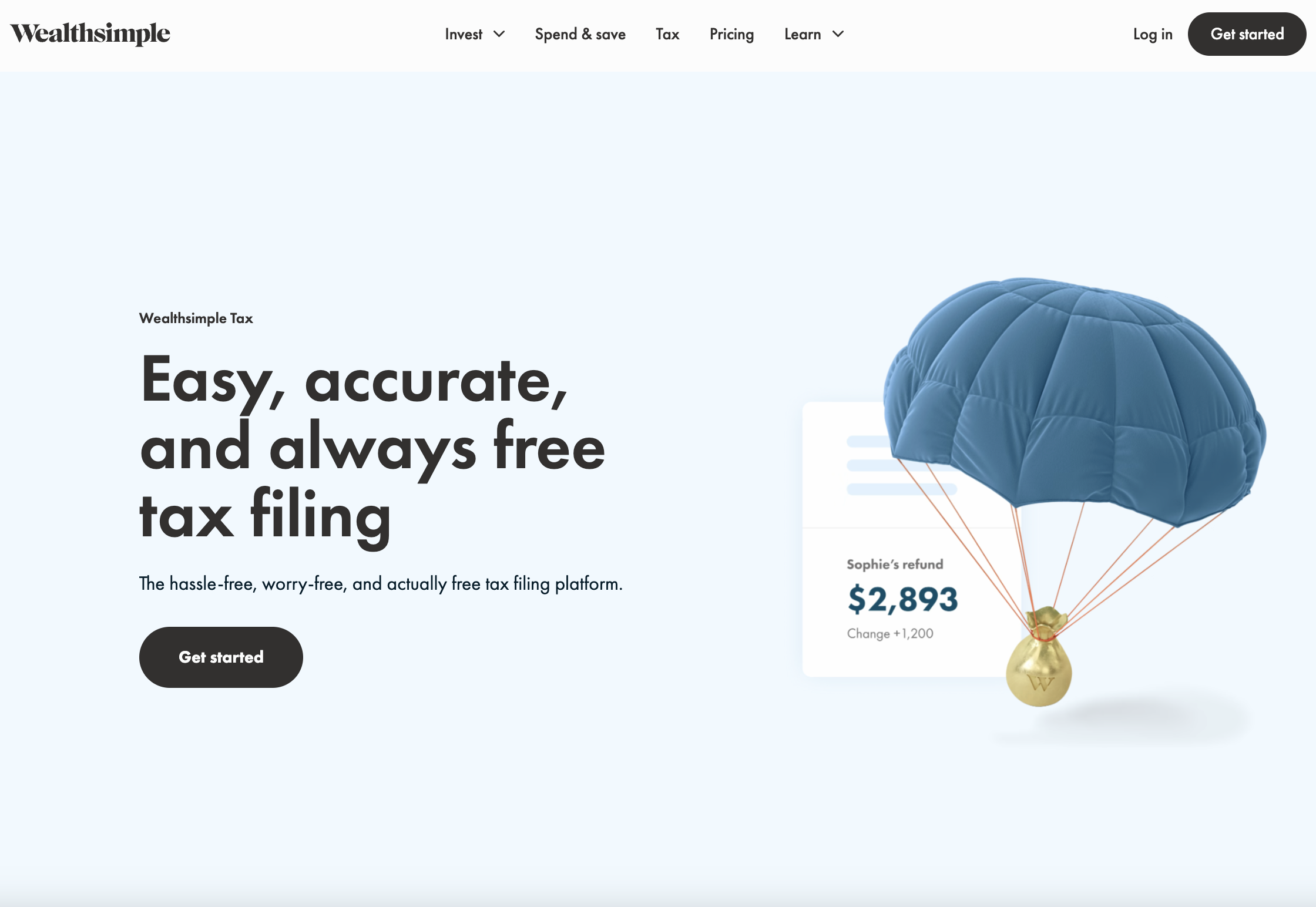 Screenshot from Wealthsimple, August 2023
Wealthsimple is an online investment management service that offers investing tools and financial advice for Canadian users. It also offers a tax filing service, Wealthsimple Tax, with a simple yet effective landing page.
Why It Works:
- Big, prominent value prop that includes the use of the word “free” – always a draw for customers.
- The copy is very succinct and focused on providing a solution to customer pain points. It also serves to reiterate that the product is free.
- Great use of color and aesthetically pleasing animations and visuals throughout that provide a payoff to the visitor.
- Customer testimonials and company logos provide social proof.
12. Scale
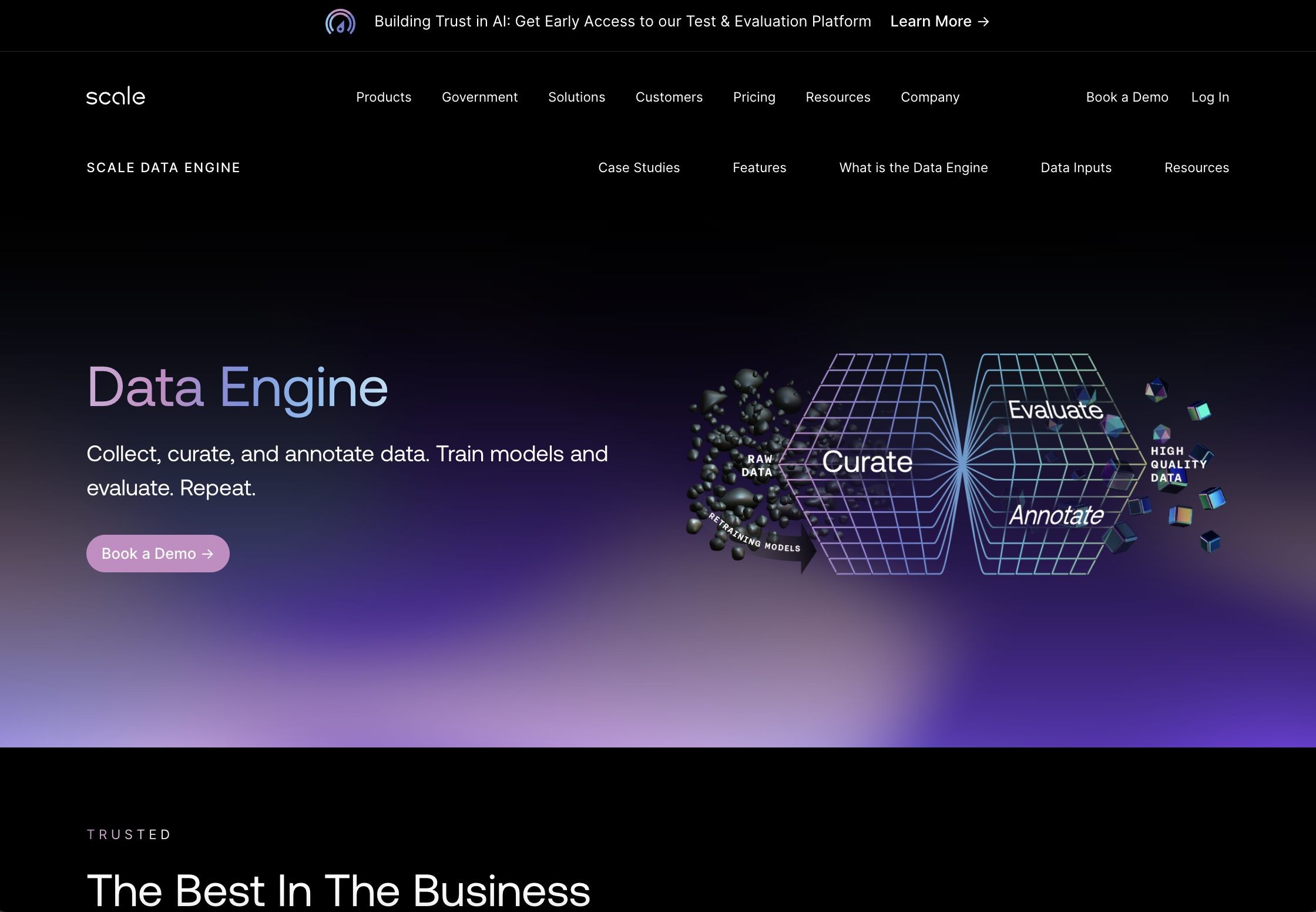 Screenshot from Scale, August 2023
Scale is a company on a mission to speed up the development of AI applications.
Its landing page for Scale Data Engine – a product that helps users collect, curate, annotate, and evaluate data – is an effective one.
Let’s look at a few reasons why it works.
Why It Works:
- Above the fold is simple and elegant, with visuals focusing on the product’s primary use cases. A simple CTA to Book a Demo keeps the focus streamlined.
- The page leans into social proof to show that it’s trusted by some of the world’s biggest companies and most advanced AI teams, from OpenAI to Meta, Microsoft, and more. Not only does the page showcase customer logos, but it also links out to more details case studies with some of these household names.
- The page is visually cohesive and focused on highlighting important features and use cases while providing enough detail to convince visitors to learn more.
13. DoorDash
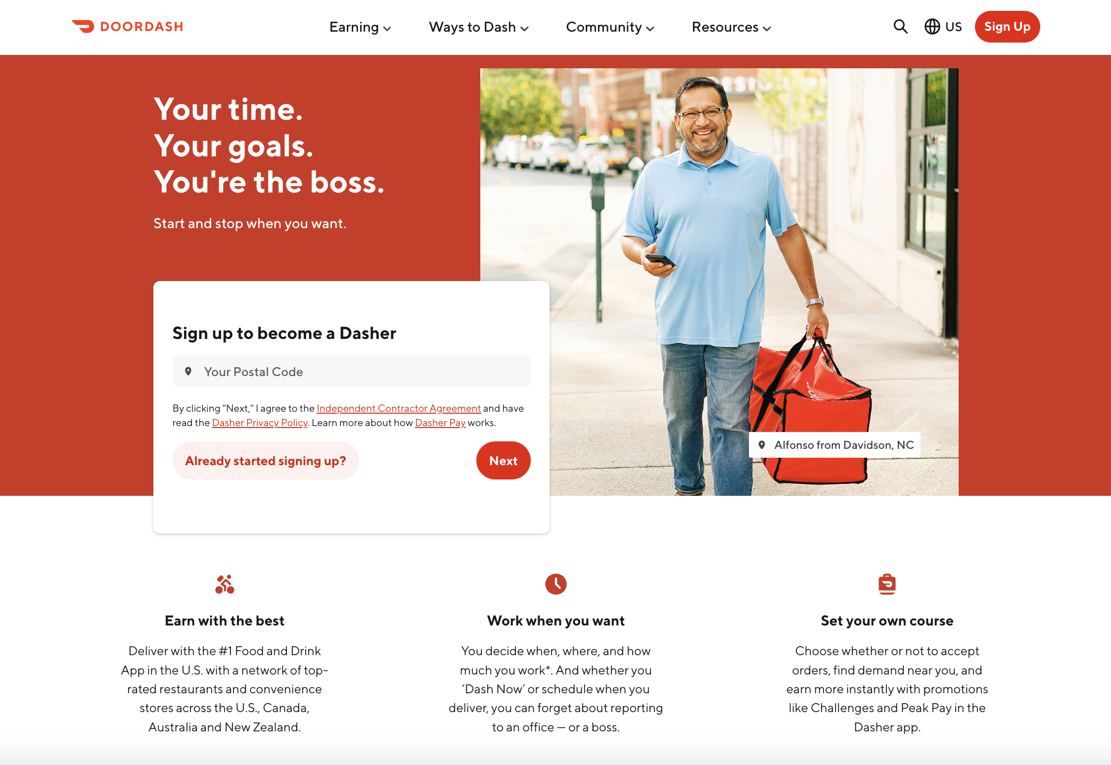 Screenshot from DoorDash, August 2023
DoorDash is an online food ordering and delivery platform that operates across the US. Customers can use the app to order delivery from their favorite local restaurants, which is then delivered by the company’s employees, known as “Dashers.”
This particular landing page is targeting prospective Dashers with the goal of encouraging them to sign up.
Why It Works:
- The hero copy on the page is focused on speaking to the visitor and convincing them why they should sign up: You can be your own boss and set your own working hours. It digs into their pain points and desires to make the sell.
- All you have to do to get started is enter your zip code and press Next – a straightforward and simple task.
- For those who want more information first, the page covers the most important questions, such as how much they can earn, what kind of gear and equipment they’ll need, and what the requirements are to sign up, as well as an FAQ section.
14. Overpass
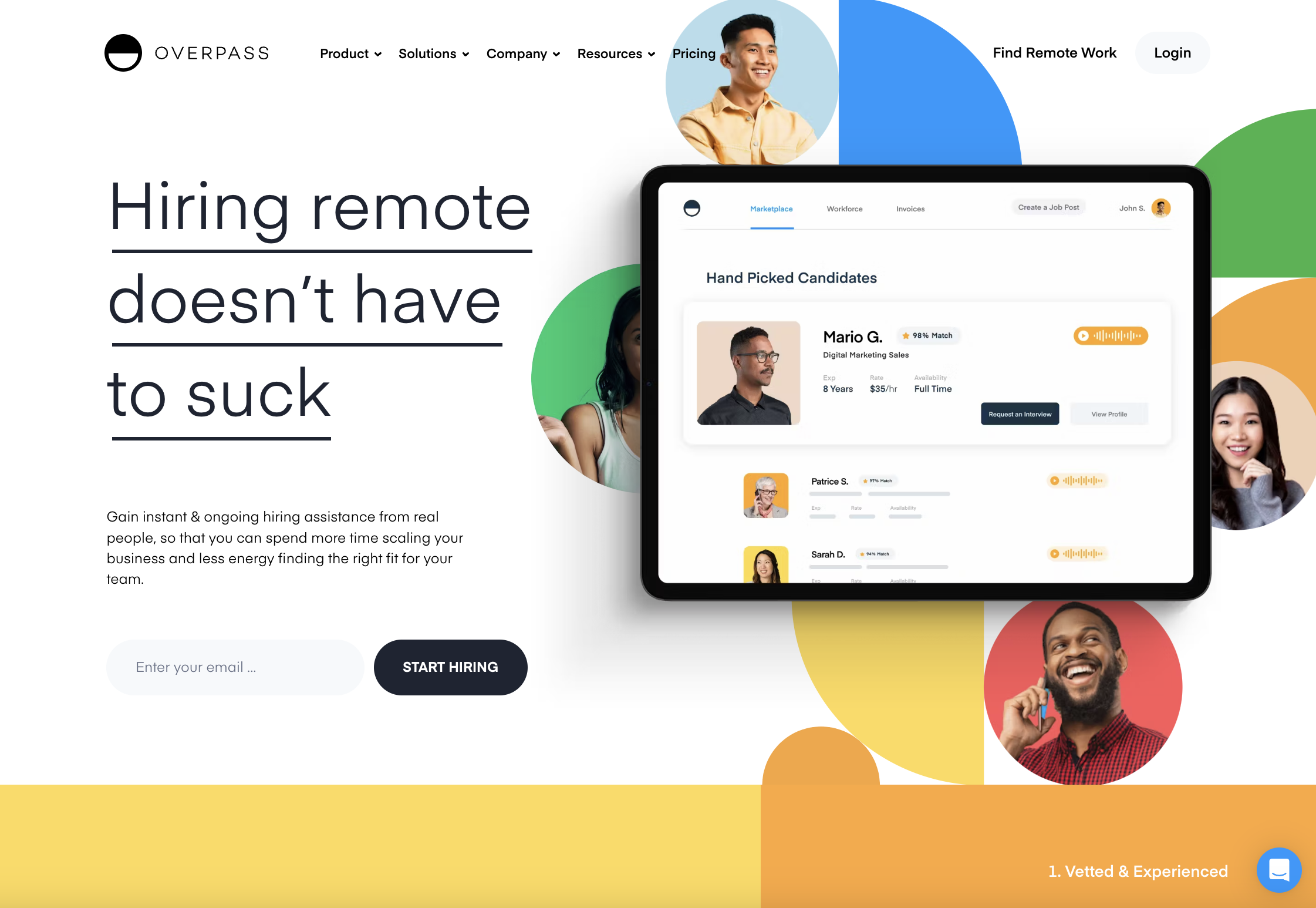 Screenshot from Overpass, August 2023
Overpass is an online talent marketplace and payment platform focused on helping companies hire and manage sales and support contractors.
Its landing page promotes its Assisted Hiring product, which provides hands-on, ongoing assistance from real people to make the hiring process easier and save customers time.
Why It Works:
- Uses an engaging tone of voice; the page opens with a punchy, effective line: “Hiring remote doesn’t have to suck.” This speaks to the painful process of hiring remotely, and how Overpass can make everything easier for customers. This conversational, friendly tone is consistent throughout the whole page.
- Fun, bright visuals and animations draw your attention and create positive brand feelings.
- Single form field and CTA to Start hiring make it feel like users can achieve their goals with the click of a button.
- Includes an FAQ drop-down menu to address some of the common questions visitors might have.
15. Miro
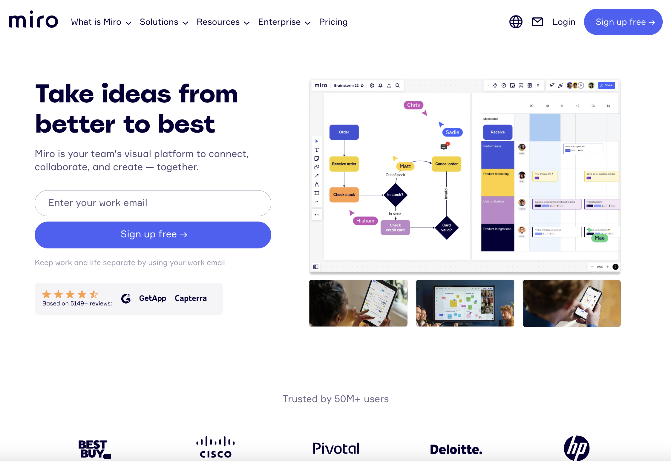 Screenshot from Miro, August 2023
Miro is a visual collaboration platform that allows distributed teams to work together remotely. Imagine a whiteboard but on your computer. You get the gist.
Anyway, Miro’s homepage is a wonderful example of an A+ landing page that provides the right information in the right place.
Why It Works:
- Miro instantly speaks to its target audience about what it can do for them: “Take ideas from better to best.” The copy throughout the page is short, snappy, and conveys exactly what it needs to about why you want this product, and who and what it’s built for.
- A single field form above the fold prompts visitors to enter their work email, specifying that using their work email rather than their personal email will allow them to “keep work and life separate.” It’s a small touch, but a nice nod to the fact that Miro knows its customers are humans, and respects their personal lives.
- The page includes numbers to showcase social proof effectively. For example, “Trusted by 50M+ users,” “Based on 5149+ reviews,” and “99% of the Fortune 100 are customers.”








![Learn To Engage New SaaS Customers With Content Marketing [eBook]](https://seorantau.com/uploads/images/featured-book-62461bd006a8e-sej.jpg)


Comments (0)